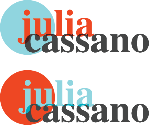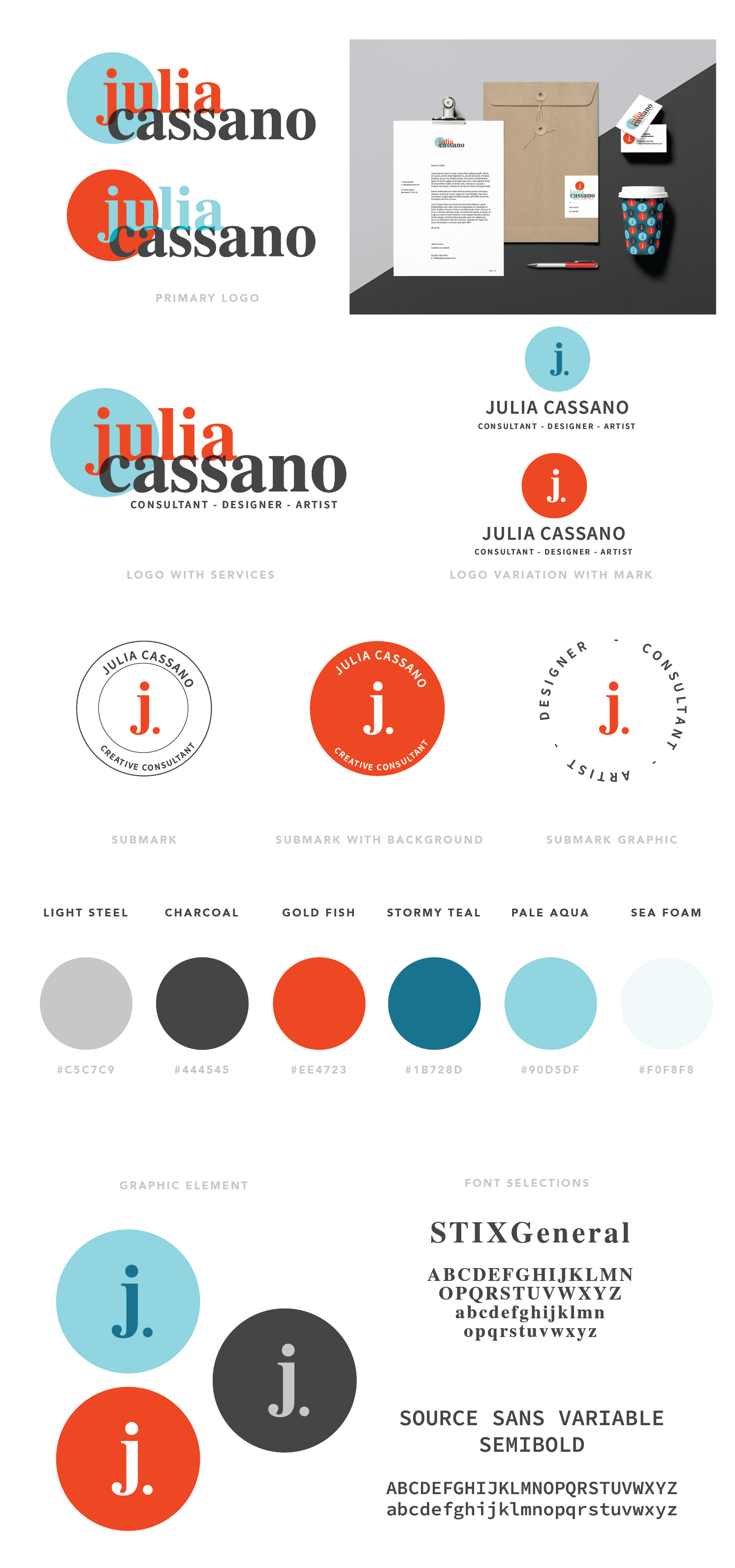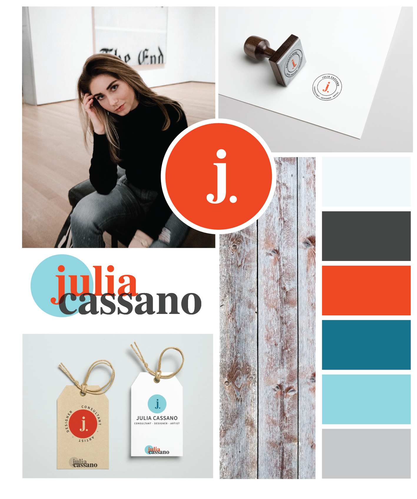
My personal rebrand explored the relationship between colors and shapes. My typefaces are simple and easy to read, and my palette is bold and bright. The overall look and feel of my brand is encompassed by the bright, circular icon with a simple lowercase “j.” The goal is for my logo and icon to be versatile yet consistent across any platform.